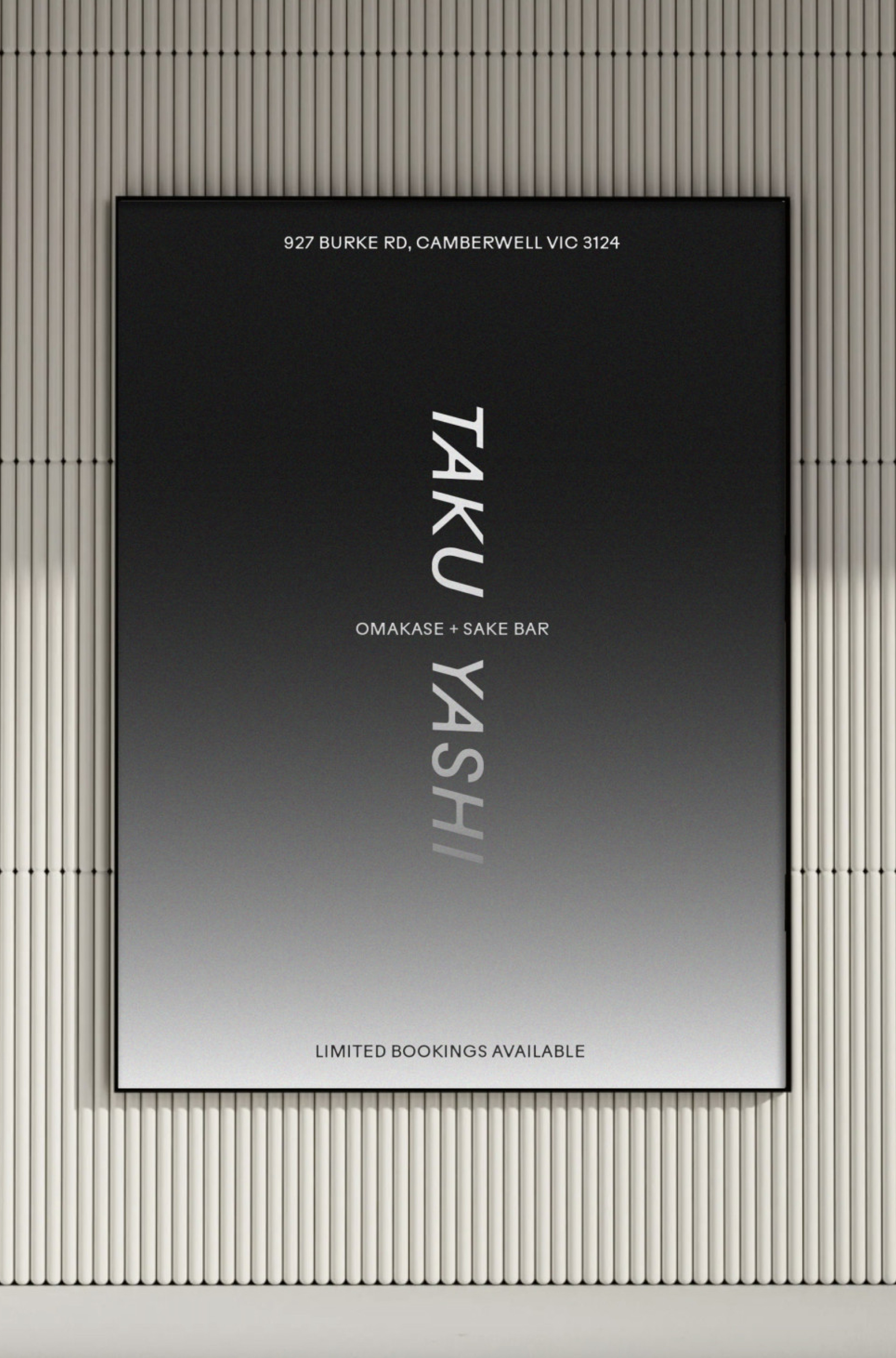
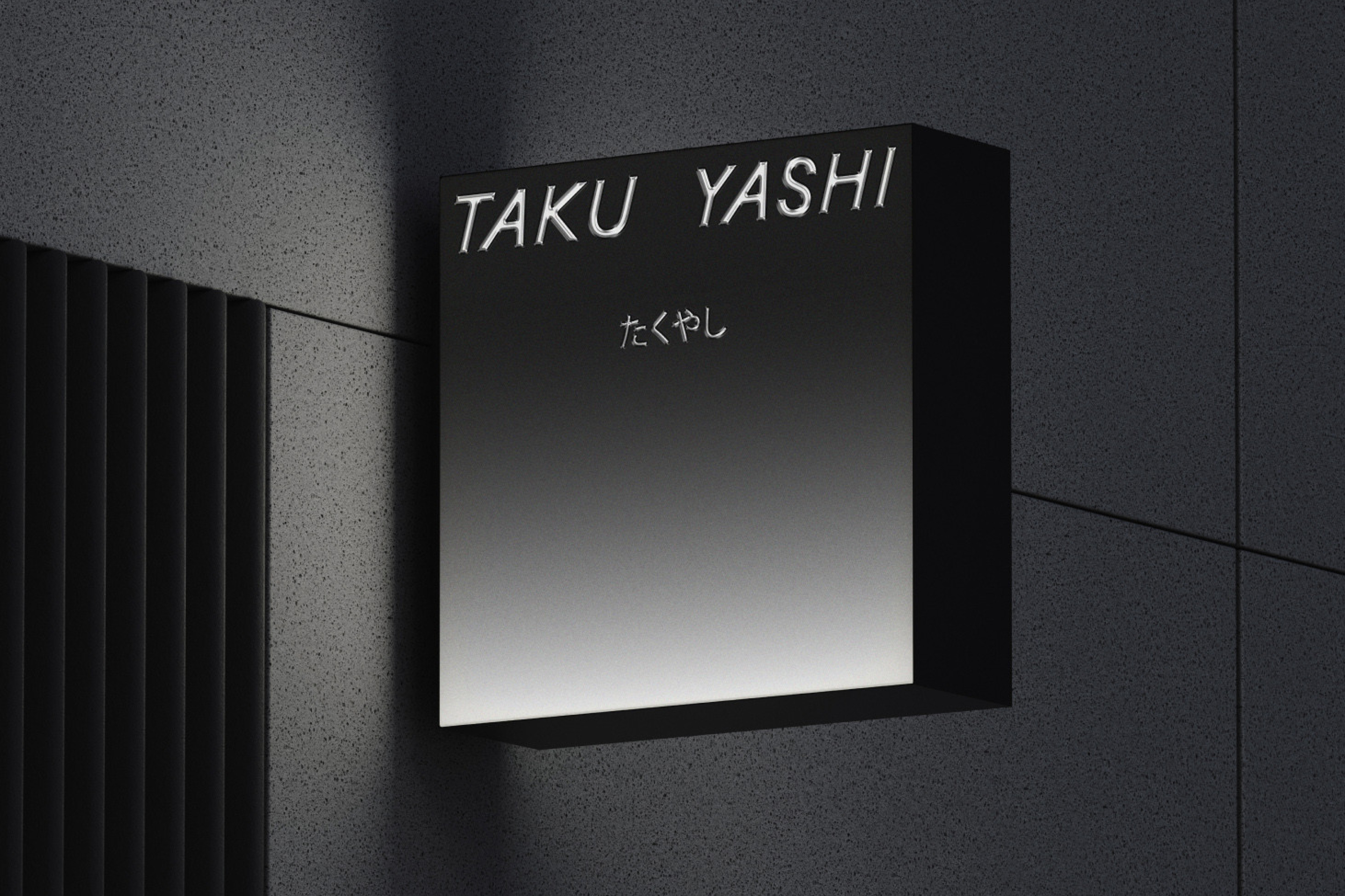
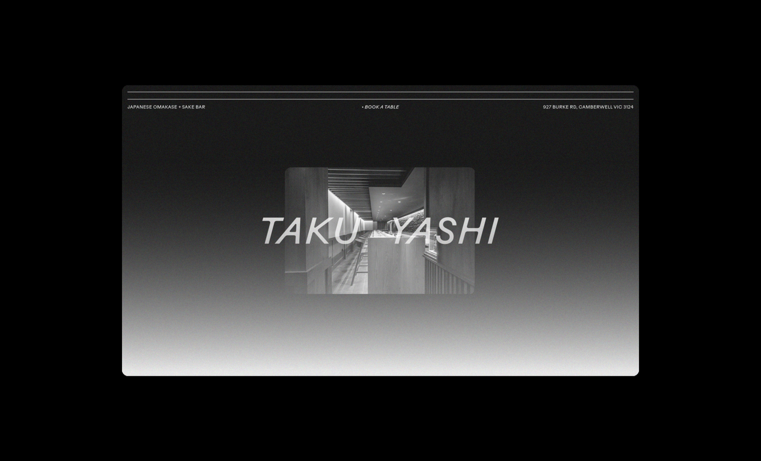
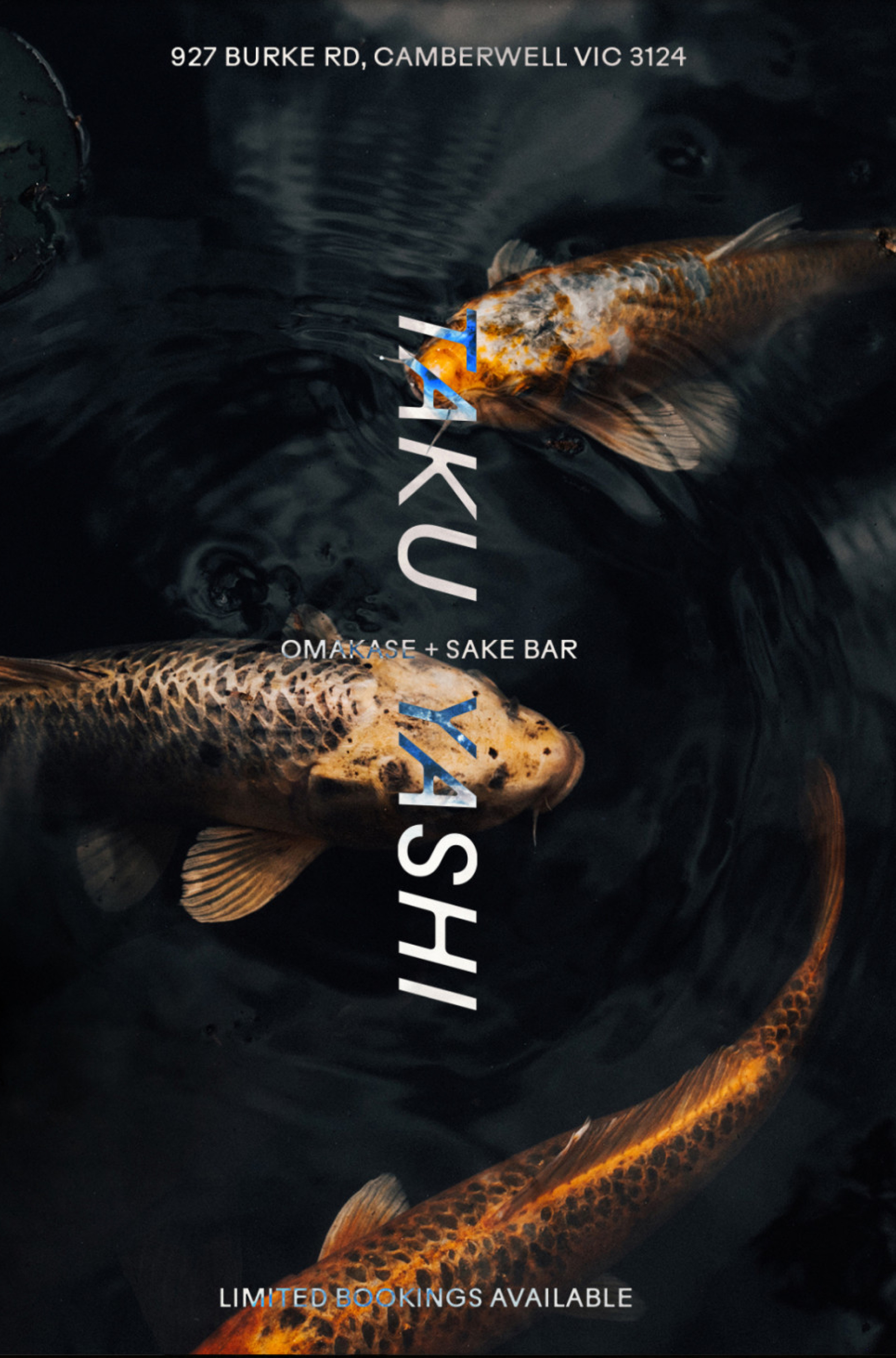
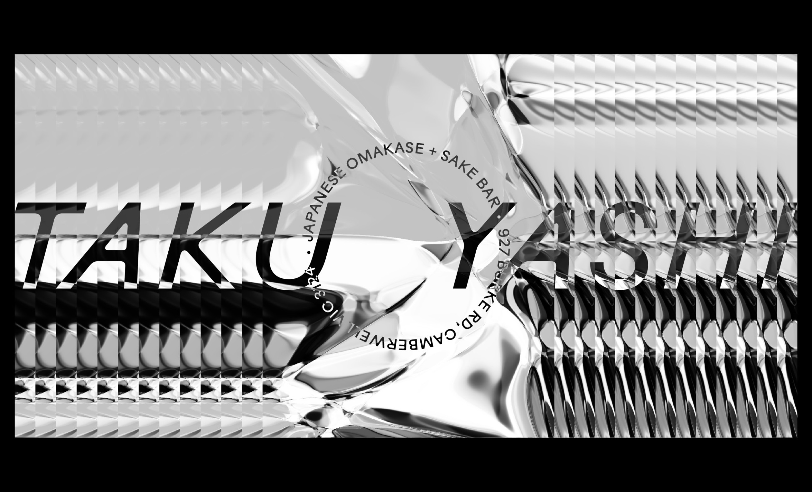
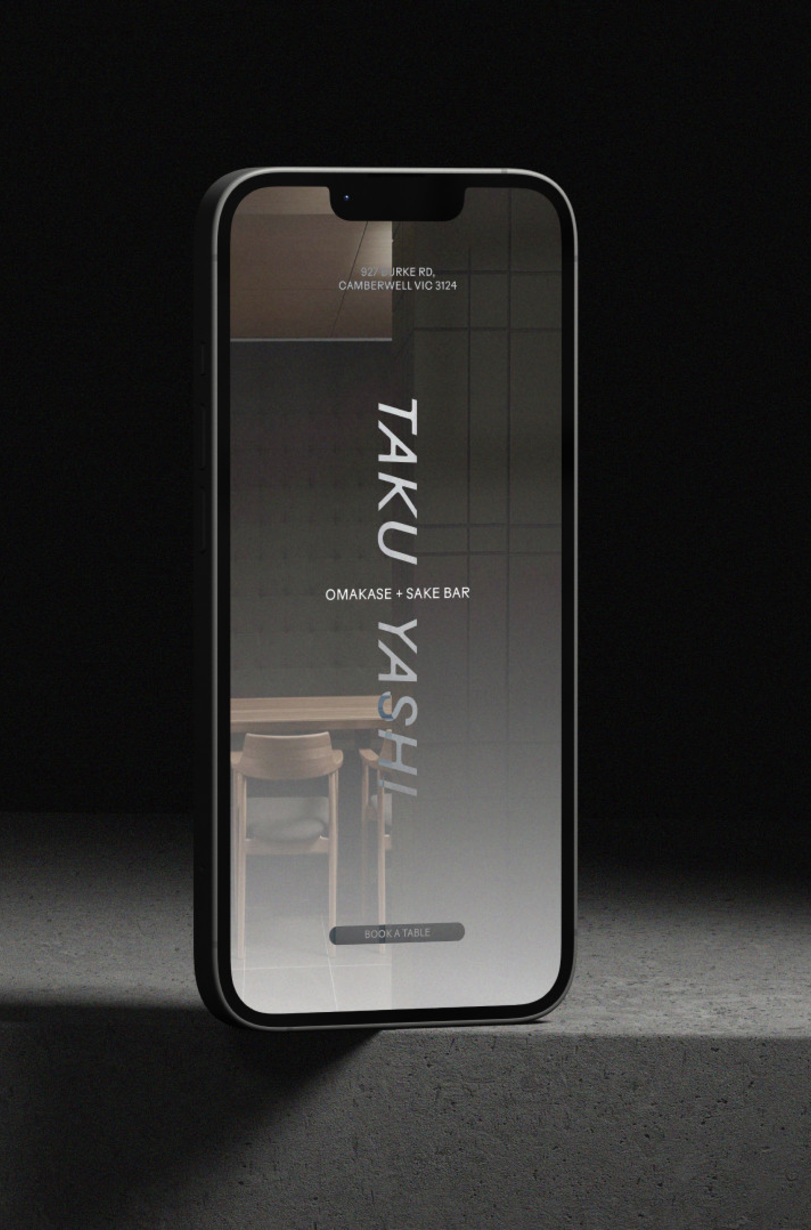
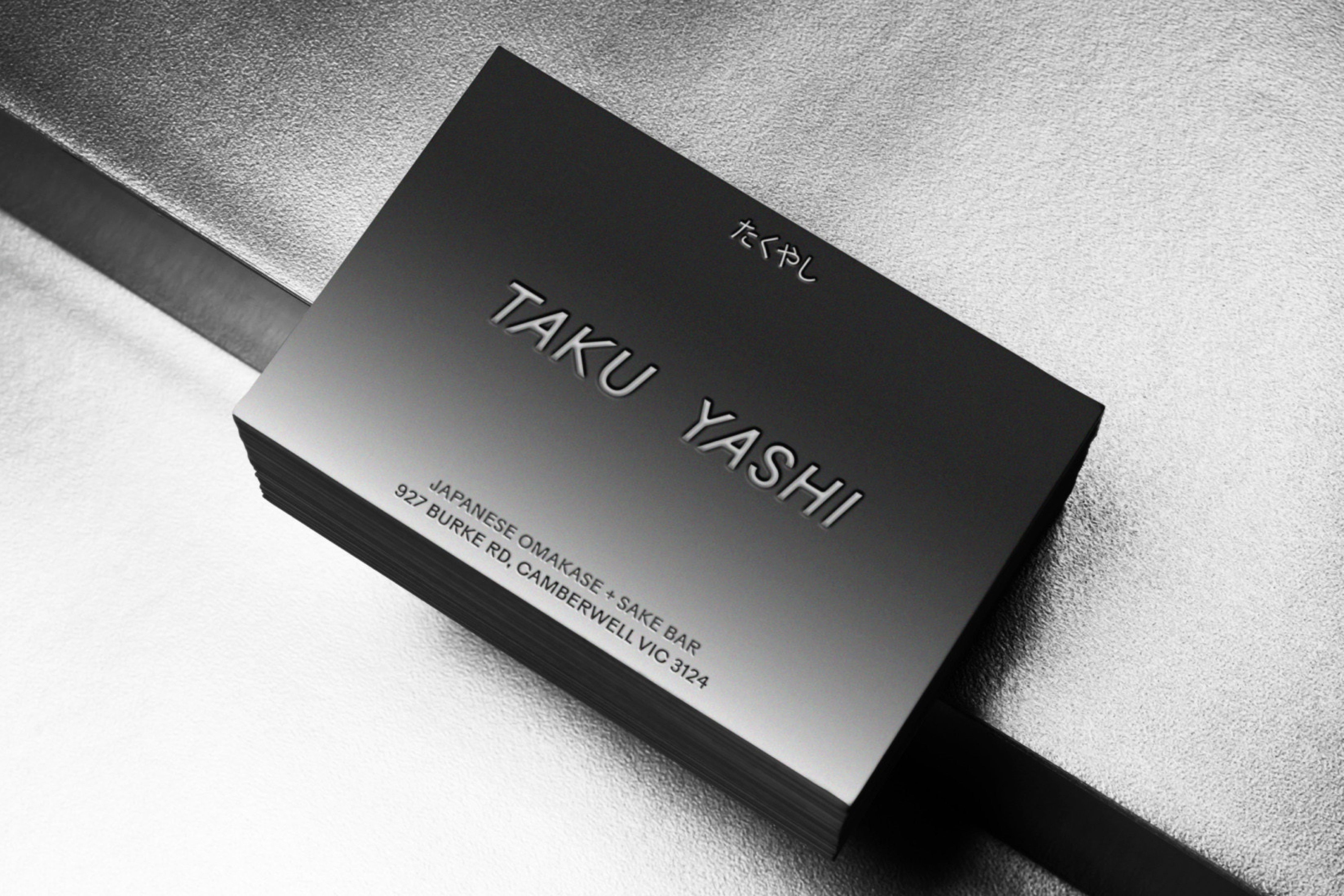
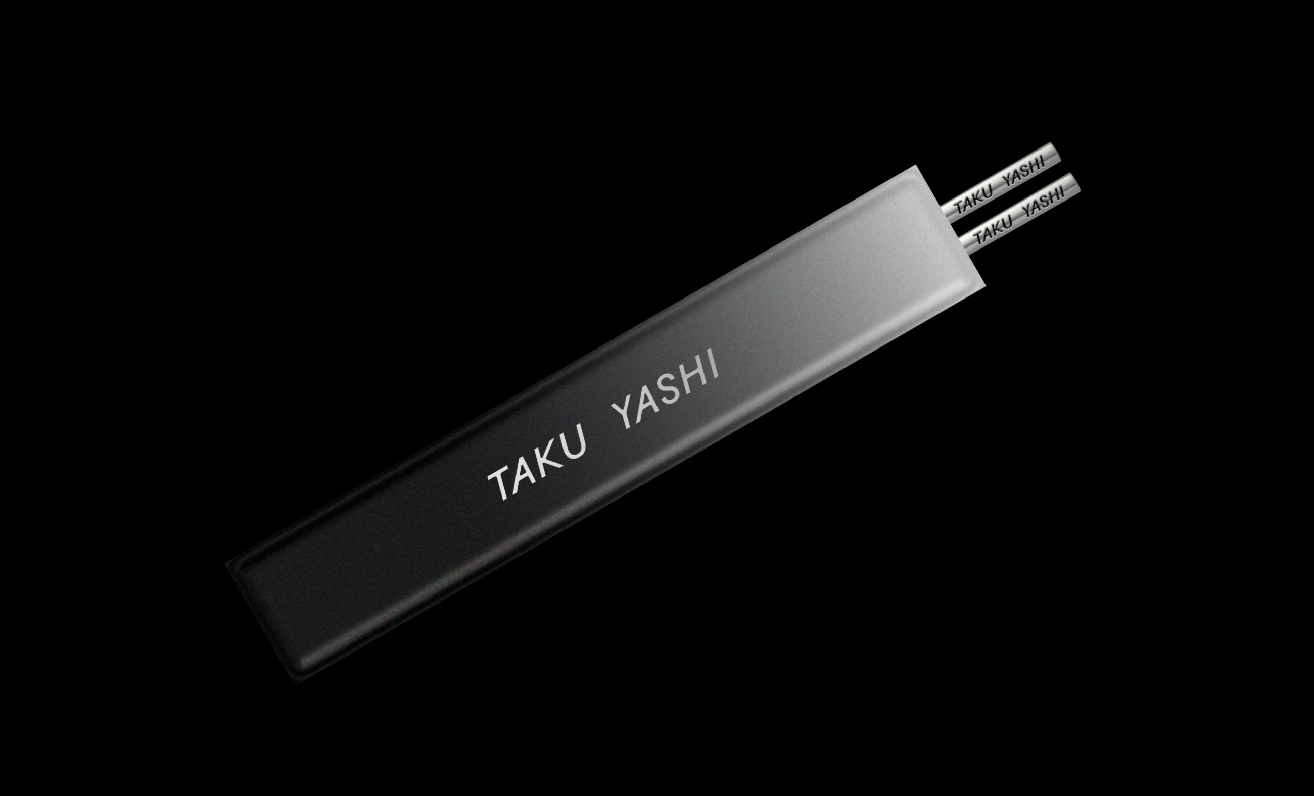
Taku Yashi
The brand identity for the Japanese omakase and sake bar required something dynamic, progressive, yet grounded in Japan's gastronomic heritage and long-standing art-form of sashimi. Notions of precision and repetition served as the jump off point for the brand language, designed to honour the specialist craft and ignite the imagination of what could be served by the chef.

Project Details
Services
- Brand Identity
- Creative Direction
- Digital Design
- Art Direction
Collaborators
- Matt Mayes

01
—
02
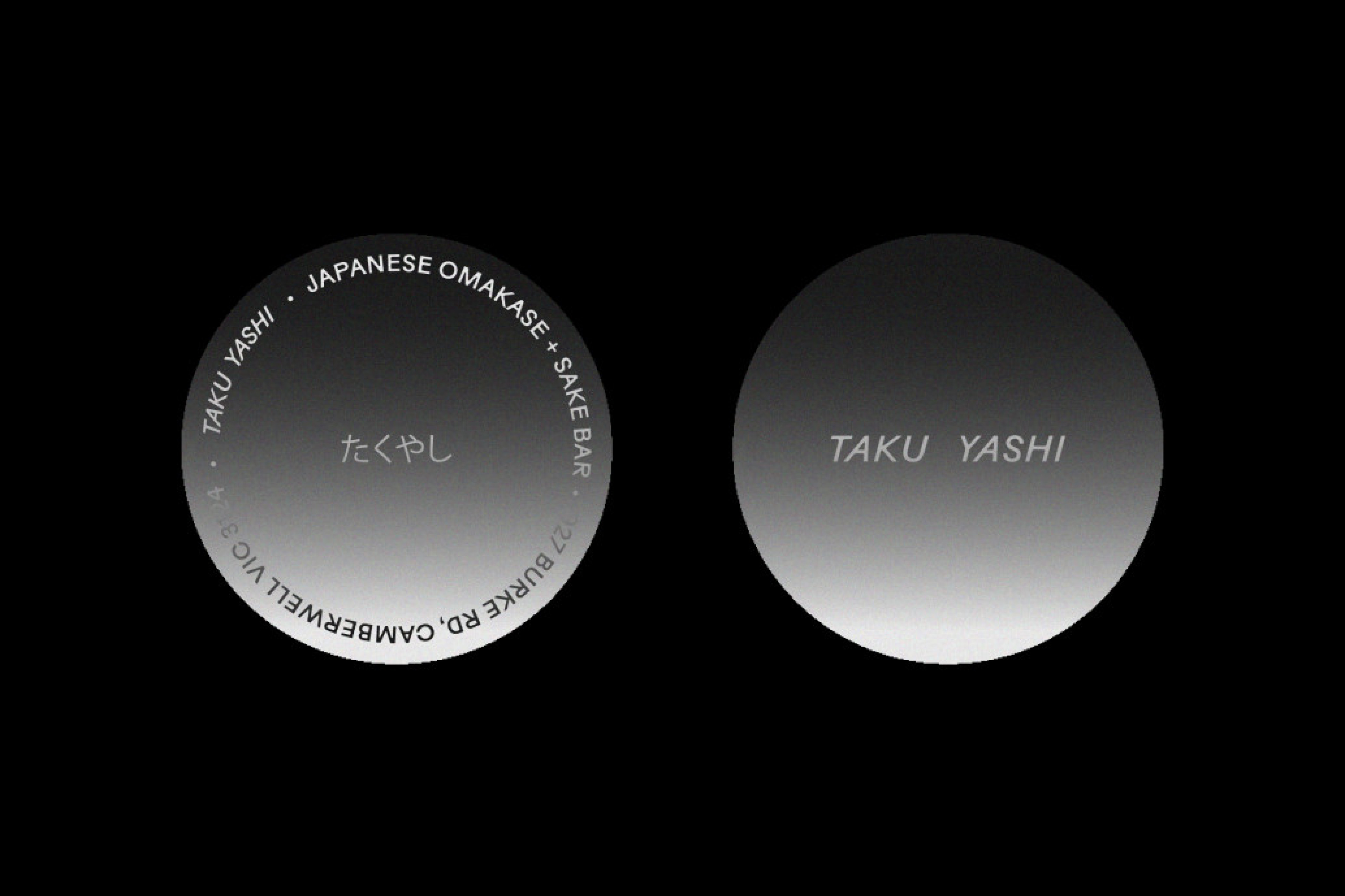
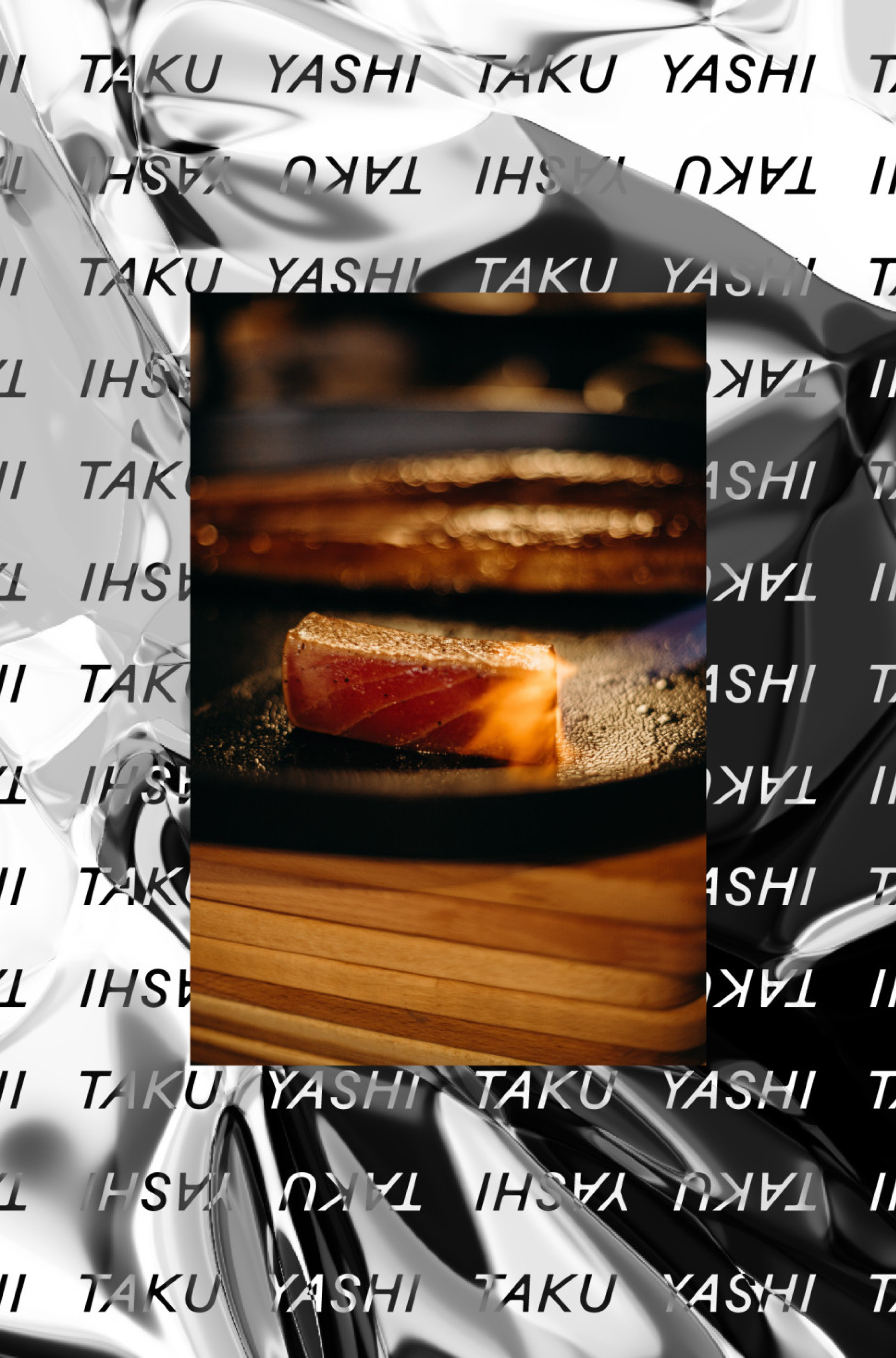
Repeated patterns of bladed typography are either juxtaposed against a liquified chrome motif or subtle textural gradients.

01
—
02

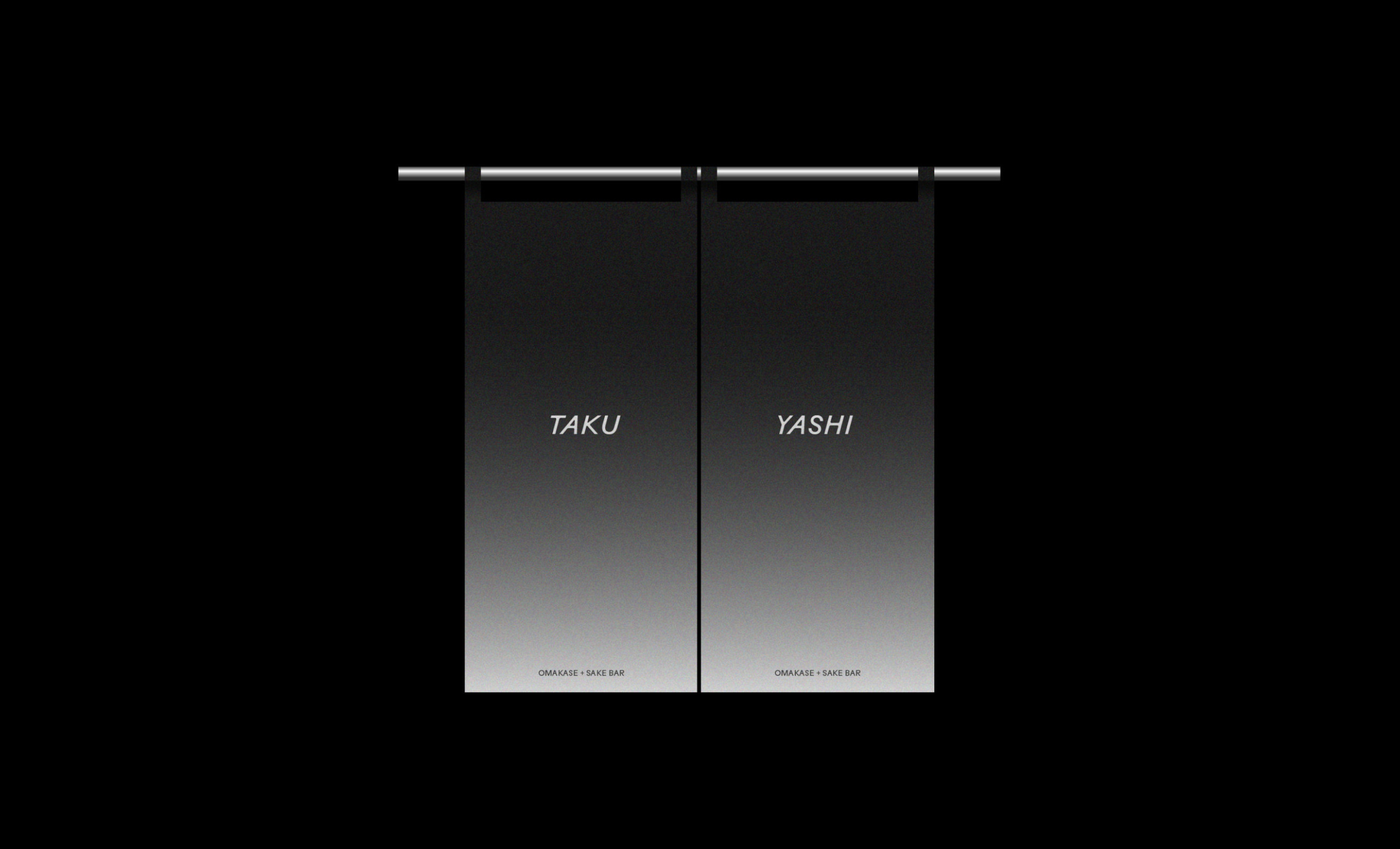
Photographic prints of Koi fish and Noren curtains were reimagined in contemporary executions to honour traditional Japanese cultural cues.